MrPornGeek
Mr Porn Geek? We’ve all been there. You’ve looked at every porn website you know of and they’re all boring to you now because of how much you watched them. That’s when you need to find a place that will showcase some of the best porn sites out there. So where do you go when that happens? That’s right, yours truly, ThePornDude.com. But unfortunately, I can’t review myself, so instead, we’re taking a look at a different site that offers similar services, but worse. Welcome to ThePornDude Lite… No, wait, MrPornGeek.com, that’s the name.
Who the hell is he anyway?
What is there to say about my good pal MrPornGeek.com that I haven’t said already. This beta male has his own perverse way of looking at porn sites and I am completely disgusted by it. I mean just looking at him you can tell that he doesn’t get any pussy. Then again, I should go easy on Mr Porn Geek, since it’s not easy being an incel. But yeah, this place tries to offer you the same services that I do but it fails miserably at reaching my height, which is normal. I am the best after all.
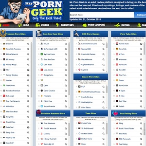
Alright, I guess since we’re here we might as well take a proper look at MrPornGeek.com. I’m telling you guys, it’s going to be hard to stay impartial for this review, but I’m doing this for you, remember that. So, this place describes itself as an adult review platform that brings you the best sites on the internet. Looks like he put a lot of research into it or did he just make use of the copy/paste button on his keyboard, when he was checking out my website? Nah, he wouldn’t do that, right?
Wait, this place looks eerily familiar
So, you’ll notice that MrPornGeek.com completely ripped off my layout and does things similarly to how ThePornDude.com does it. They say that imitation is the biggest form of flattery, so why not just copy me and do exactly what I do. It’s way easier than to bang your head and come up with fresh ideas. Even those short category descriptions he has are the exact same as mine. To be truthful, after I introduced them on my site, the flock followed, and they all know it that this is the stone cold truth! In fact, maybe he should try copying me on other fronts too. Ditch that stupid haircut and get a proper shirt. But I guess no shirt suits you when you’re as skinny as an Ethiopian child.
The color scheme on this website, wack. No dark mode, wack.
Right, impartial, keep it together PornDude, you don’t want to destroy the guy you just want to review his copy/paste site… Okay, so what about that design then? Well, I already mentioned that he has the same layout as me, but at least the colors are different. But, I mean come on, blue and… fucking lime green? Who thought that this was a good idea when they were fucking around in the CSS file? The Green Lantern? It’s all about the orange and gray baby!
I mean the whole place just looks like a low-res version of yours truly. And while this beta cuck is busy drooling over his tablet from 2010, I’ll keep it busy by hustling and giving you the best porn site reviews on the planet. I won’t even waste your time by having to load a fucking gif when you go to my site. Now I’ve got this fucking guy on loop, ogling over his tablet like a weirdo cached on my computer. Beware when you load MrPornGeek.com, cause what you see stays on your PC until you clear that cache. Just some friendly advice.
A rookie mistake, the dreaded home button
Alright, alright, so what does the site offer as far as functionality goes? Well, first things first, I’ve gotta roast him for this one. That’s right folks, like a plebe that he is, he put a big fat Home tab on his main navigation bar. Get with the times pal, we’ve got your ugly ass face to click on if we want to go to the homepage of your website. We don’t need an unnecessary button that just clutters the page and makes it look all messy.
Right, so after that we’ve got the Blog tab and I won’t even dare going there. Who knows what horrors lie in the head of this guy. I mean he didn’t even add a hover effect for all his tabs. Not even a simple transparency flick. That’s literally 3 lines of code that he has to write. Is it that hard to make your website look more presentable ? I swear, some of this stuff gets on my nerves sometimes. It’s little things like that, that separate the losers from the champs.
The adult review platform presents you with… Videos?
And then we’ve got the… Videos tab? I thought this was a review platform, what’s going on? I mean, if I wanted to watch porn, don’t you think I’d choose one of the countless links that you’ve got on your homepage? Why would I ever, and I mean EVER, want to watch porn videos on your site. The only reason I’m here is so that I can find a site where I can watch the best porn out there. I don’t want to settle with that mediocre bullshit that you’re serving me with.
It’s not all bad, at least we can check out some pornstars
Then we’ve actually got a semi-useful tab, which has to do with Pornstars. This is more like it. This is why sites like yours exist. We’ve got a coherent list of so many different porn stars here and we can scroll through them and filter them according to the first letter of their name, or we could sort them alphabetically or according to their popularity. Now, there are sites that simply have more pornstars on them to look through, but with over 600 pornstars to check out, MrPornGeek.com has certainly put in the work here.
An actual use for this site, coupons
Alright, so the next tab up here is the Coupons tab and… Oh for fucks sake . You couldn’t even get a proper gif with a transparent background to act as an icon here? I mean you can clearly see the outline of the box that the gif is contained in. Oh well, a minor bug but it stings your eyes whenever you get on MrPornGeek.com. It’s one of those things that’s just impossible to unsee. But the contents of this tab are actually quite nice.
You can actually get some really nice coupons here. We might as well make some use out of MrPornGeek.com, right? Anyway, the last two tabs just lead you away from this website, so we won’t even go over the Dating and Cams tabs. And I just noticed, the Cams tab actually has a hover function with an underline going for it. Amazing. One question though. Why not do the same for the rest of the tabs then? Fucking amateur.
Categorization is on point, thanks to me of course
I guess one thing that MrPornGeek.com does right is the categorizations of all the sites. It’s the same format I use so there’s no going wrong there. In fact, you guys already know that I cut right to the chase and don’t sugarcoat it with any bullshit. I don’t need any tabs or anything like that to give you the content that you deserve. I mean who even cares about videos on this site, I still don’t get the point of that tab.
Overall, ThePornDude Lite- I mean MrPornGeek.com is a site where you can check out some of the best porn sites on the planet. Sure, you’ll find that everything is better on my site, but if you ever wanna change things up a bit, I guess you can check MrPornGeek.com out and give the fella a shot. I mean just look at his dumb haircut. We need to increase the traffic to his website so that he can afford a hairdresser or something. Shit’s embarrassing.
Pros of MrPornGeek:
- + Pornstars tab for all your pornstar needs
- + Good categorization of websites
- + Generally many reviews to choose from
Cons of MrPornGeek:
- − Bad design choices and graphical bugs
- − Useless navigation bar tabs
- − Stupid haircut
- − He’s no TPD